









UX in ATX
Overview
Client: UX in ATX (2020)
Roles: UX/UI Designer, UX Researcher
Tools: Adobe XD, Miro
The stakeholders of UX in ATX desired their own website to grow their organization and eliminate reliance on the Meetup platform.
Research and definition
Our project began with research: starting with a stakeholder interview. Questions were chosen to find the purpose of UX in ATX, the objective of the website, our constraints, the project timeline, and other similar factors. When this information was gathered, we turned our attention to the needs of users.
Miro was used as a platform for collaboration. Dot-voting was employed throughout the project for aligning our team and task prioritization. The process of quantitative research began with brainstorming questions for our user survey, which was later published on LinkedIn. Survey feedback was used to assist in generating questions for user interviews, our process of qualitative research.
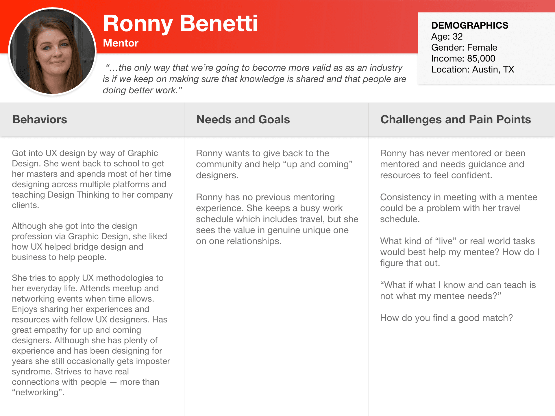
The accumulated feedback from the survey and individual interviews were organized into an Affinity Diagram on Miro. We analyzed the data and continued to narrow down our User Insights. Ultimately, five User Personas and Journey Maps were developed to reflect these insights:
Our results were shared with stakeholders to establish objectives for the project. With a clear and concise outline of user and stakeholder requirements, we began ideating.
Information architecture
As our attention turned to the overarching structure of the website, ideating began on Miro and culminated in Card Sorting. We chose to offer users the opportunity to Card Sort in an effort to better understand their thought process when navigating a website. Feedback was evaluated and a Site Map was developed to visualize user navigation patterns.
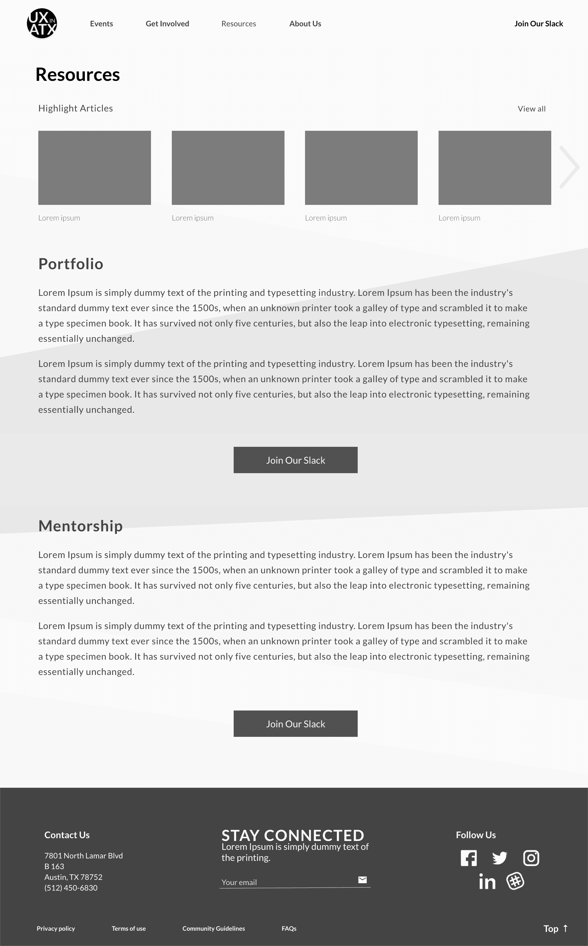
Our team diverged to ideate individual Low-Fidelity wireframes in Adobe XD, the tool selected for wireframing and prototyping. We later convened to consolidate the best design elements in preparation for a stakeholder update. Initial designs were successful and with approval from the stakeholder, we prepared a Moodboard to align our inspirations and began the creation of a Mid-Fidelity prototype.
Prototyping and iteration
Once a Mid-Fidelity prototype was ready, two rounds of user testing were conducted. Following each round, the prototype was updated according to feedback insights. At the end of the first round of testing, our team discovered two unexpected issues:
Our website navigation made use of dropdown menus. However, there was a lack of content at the time to properly facilitate a dropdown menu for each section.
Some pages, such as Mentorship and Portfolio Review, had only minimal content and were intended to function within the UX in ATX Slack channel.
Our solution was the introduction of Tabs, a secondary navigation element. This implementation replaced the dropdown menu feature and resolved the issue of minimal content pages by storing their content within subsections of major pages.
At the end of the second round of testing, our team convened to reanalyze the project scope and timeline prior to transitioning toward a High-Fidelity prototype. Current and future tasks went through a process of ruthless prioritization, resulting in greater clarity and understanding of our next steps.
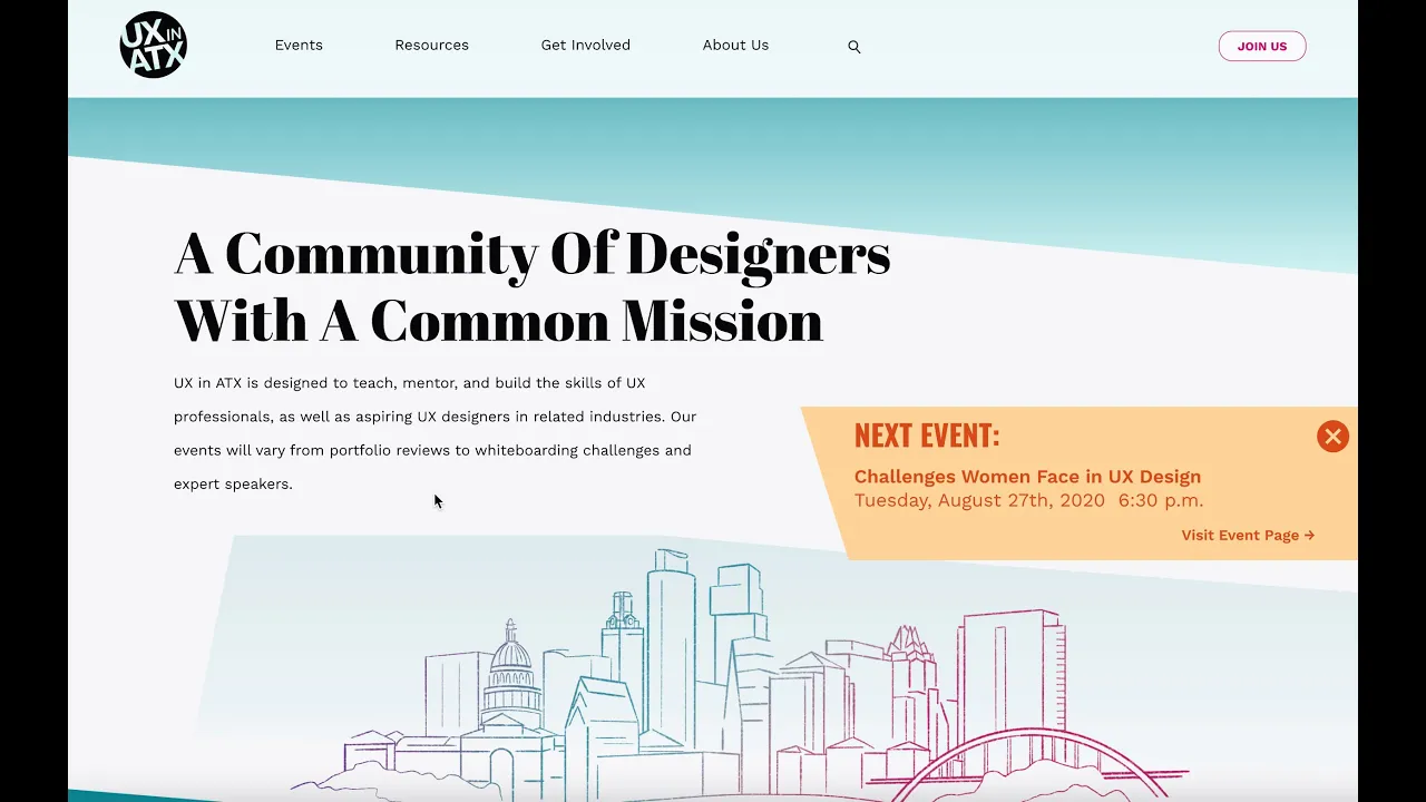
The transition to high-fidelity required deeper refinements and additions to our existing prototype. These included:
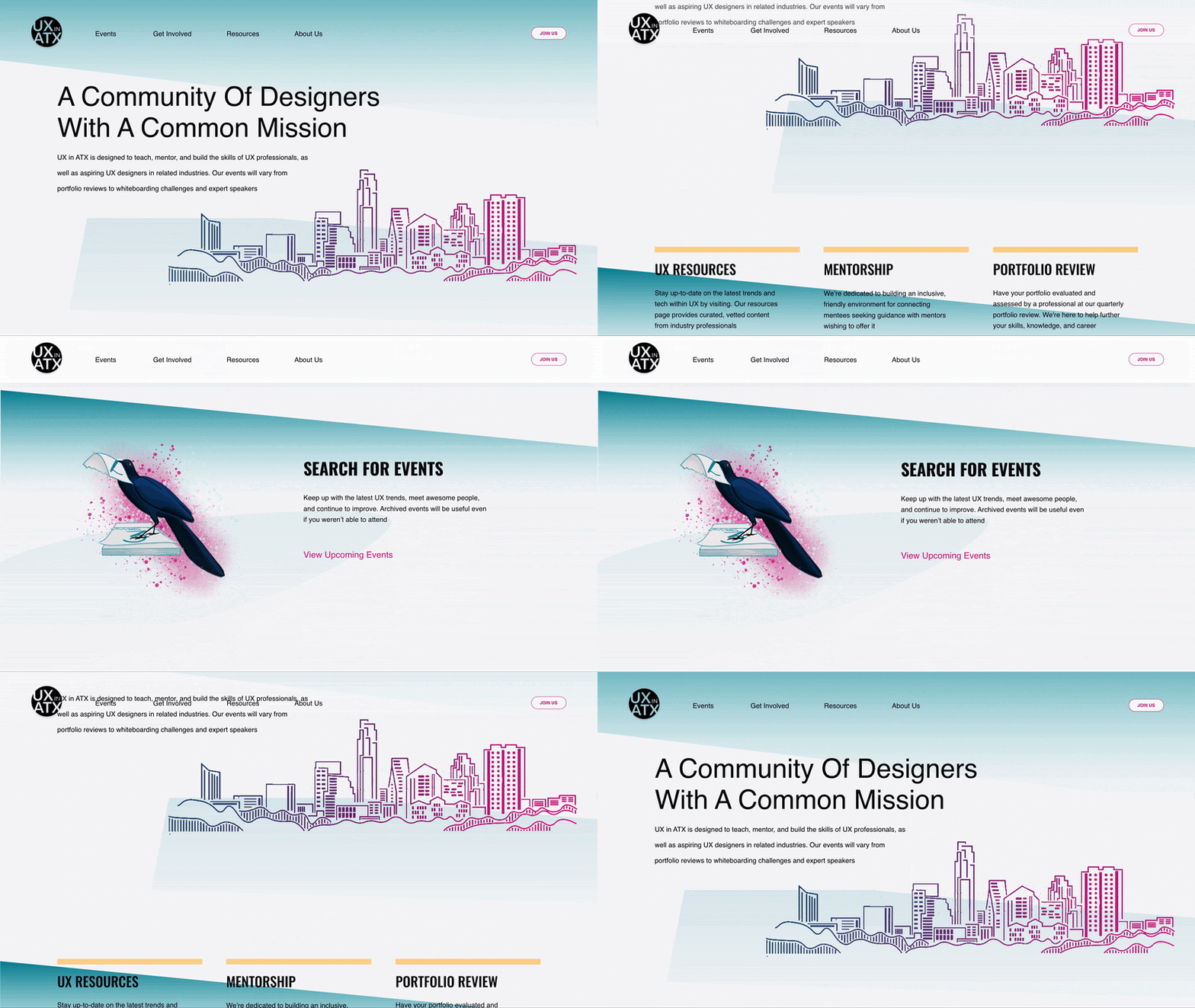
An illustrator being brought onto the project to provide graphic design elements for the website. The Grackle, a common bird in Austin, was chosen as the website mascot.
A Style Guide was developed to coordinate the visual identity of the website. The overall Brand Identity of UX in ATX was also refined.
Mobile Designs for the website were ideated and developed following the rules of the Style Guide.
The search filter was given an overhaul functionally and aesthetically, with designers dot-voting on tags for the filters of individual pages.
A Verbal Identity was developed, shaping the tone and copy of the website as well as the UX in ATX brand.
We aligned with stakeholders and established a hand-off date prior to our third round of user testing.
Prior to the fourth and final round of user testing, our team realized specific features of the website required individual A/B testing. However, user turnout for testing began to decline. This led to the decision to conduct A/B surveys through LinkedIn, obtaining user preferences and feedback. Preference surveys included elements such as the inclusion of parallax scrolling, the layout of search filters, titles for sections of the website, and the location of the homepage banner.
Results from our A/B surveys helped guide our changes to the current prototype. Once complete, we conducted the final round of user testing.
As we analyzed insights from the tests, our team discovered the need for a navigation dropdown menu. As the scope of our project increased and more content was available, a dropdown menu fit naturally within our designs. This addition was promptly included as the prototype reached finalization.
As we prepared for the developer hand-off, we applied redlines and annotation to our final iterations and concluded with the completion of our website case study.
Insights and lessons learned
Over the course of nine months, our team faced a number of unique challenges. All work on this project was done remotely due to Covid-19 restrictions and safety precautions. This situation limited our capacity for more traditional collaboration methods but we swiftly adapted to our restraints.
The greatest challenge was developing a project plan. From the beginning, we desired to not only rely on each designer’s strengths but also to afford the opportunity to share knowledge and teach one another. This project was a chance to build skills beyond our usual repertoire.
As we continued our process, the project’s scope increased dramatically. Due to Covid-19, UX in ATX experienced a boom in its global presence, requiring our designs to reflect this larger audience. By the end of the project, the membership of UX in ATX increased from 500 members to 1300 members.
Some situations felt “messy”, such as the period prior to our transition to the high-fidelity prototype. There were many elements in our design that had not been previously considered, such as the overhaul to UX in ATX’s visual and verbal identity. There were also a number of technical frustrations related to Adobe XD, especially when multiple designers were working within a shared file.
Project management and the exploration of alternative tools will definitely have greater importance in future endeavors. Despite these hurdles, our team persevered with detail-oriented quality assurance. Upon completion of the designs, stakeholders were given all deliverables and assets for developers to begin building the website.

