


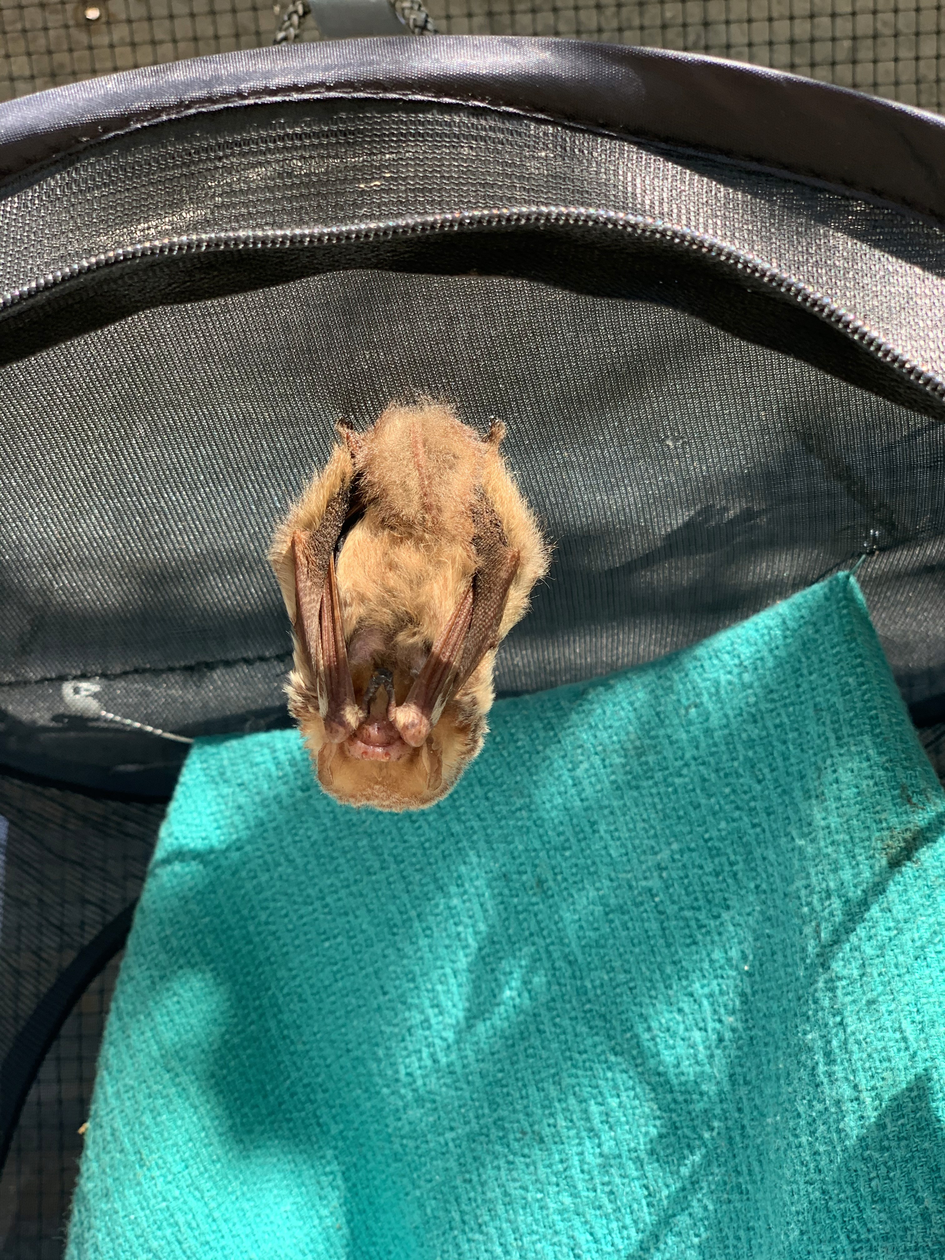


Austin Bat Refuge
Overview
Client: Austin Bat Refuge (2019)
Roles: UX/UI Designer, UX Researcher
Tools: Adobe XD, InVision, Miro
Austin Bat Refuge, a non-profit organization, desired a branded website to reduce misinformation about the local bat population.
Research and definition
Research began with an online survey, followed by individual user interviews. Our focus was the public perception of bats and how we might better educate people to eliminate negative superstitions. The data was collected and analyzed in an Affinity Diagram.
66% of people are not afraid of bats. Most like bats or are okay with them.
50% of people would leave an injured bat alone if they found one.
33% of people would research next steps if they found an injured bat.
After thorough data analysis, we came to a conclusion. “People appreciate bats and most acknowledge their role in the ecosystem. However, people are apprehensive towards bats due to the possibility of carrying diseases.”
Next, we identified the components and essential activities of the non-profit organization through a Business Model Canvas. The insights gathered from potential users and the organization were translated in a User Persona.
Throughout the research & definition phase we met with stakeholders to better understand their organization, its purpose, and their desires. We connected regularly to provide updates, obtain feedback, and promote transparency.
Information architecture
We turned our attention toward improving the overarching structure of the website and performed a SWOT analysis based on our insights and key findings.
Strength: Very active and consistent across Facebook, Twitter, and Instagram.
Weakness: Text-heavy pages make it difficult for users to find information quickly.
Opportunity: Education through blog posts while boosting search-engine optimization.
Threat: Information overload causing user drop-off due to distraction or loss of interest.
We created a Site Map to illustrate the current structure and navigation of the website. Each cards represented portions of the website and allowed us to begin rigorously reorganizing content through Card Sorting. After hours of relocating, altering, combining, and sometimes removing cards, we developed a new site map. The website’s lack of a footer gave us the opportunity to incorporate it as a prominent element of our redesign.
Wireframing and prototyping
Upon completion of the new site map, we narrowed our scope to individual pages and their layout. Low-Fidelity Wireframes focused on dividing content into chunks to prevent users from becoming overwhelmed by over-sized images or walls of text.
At the same time, we began developing a Style Guide to ensure visual consistency across the website. We created a Moodboard and referenced many websites and the elements that made their designs successful. From these themes we established three major pillars of our redesign.
Avoid dark, intimidating colors. Focus on cheerful, earthy colors.
Include vibrant reminiscent of the local, Austin culture.
Incorporate a clean, sleek design across the entire website.
Soon after we began development of the High-Fidelity Wireframes and Prototype. While considering our user’s path to success, we decided to combine elements of the User Journey Map and User Flow. This solution also functioned as the scenario for our future Usability Tests.
User testing and iteration
The High-Fidelity Prototype was built in Invision and user testing was conducted on both mobile and desktop devices.
Insights and lessons learned
As our project reached its conclusion, we had a few key reflections based on feedback received from user tests.
Users needed more visual cues for scrolling down. Some users were not aware the homepage had content below the banner.
Information should be immediately accessible. Users expressed concern when having to click “Read More” on the “Found a Bat” page considering the importance of that information.
Our team also contemplated the next steps of this redesign should we continue working with our stakeholders.
Iterate designs based on key findings.
Redesign the ABR blog.
Redesign the ABR shop.
Develop a “Bat-Tracking” widget.
Upon completion of the project, stakeholders were given all deliverables and assets to use as they see fit.
